Tuesday, February 26, 2013

Summer of calligraphy


Summer here in Wellington is marvellous this year. I have even been swimming in the sea! And my work has been about exposing more people to the joys and sunshine of calligraphy.

The National Library reopened at the end of November after an extensive face lift. It was a delight to be invited by Ruth Lightbourne, the curator of the Alexander Turnbull Collection, to teach illumination and calligraphy as part of the exhibition, "To the Ends of the Earth: Bibles in the Alexander Turnbull Library". Here is a link to the talk on making pigments  http://natlib.govt.nz/events/alison-furminger-demonstration-on-making-pigments 

Adults and children alike were delighted to discover how to make an illuminated letter using gum ammoniac, transfer gold leaf and gouache, and another group of adults had a go at a pro-Gothic hand using quills. The workshops were kindly sponsored by the Alexander Turnbull Endowment Trust. The workshops were certainly successful in getting people into the National Library and allowing them to discover the delights of the illuminated manuscripts on display.

Lightfastness test for "Luminance" coloured pencils. Left hand side was exposed to sunlight for one year.

In answer to a promise in a previous post, here at last are the results of my lighfastness test of the new Caran d'Ache "Luminance" coloured pencils. True to their claims, the lightfastness was exceptional. One year in a north facing window in direct sunlight, and there were no obvious signs of fading. This range has certainly solved the problems I have had with the general poor lightfastness of coloured pencils. I have noticed with our extremely hot summer that some of the leads have got mottled white specks as a result of the heat, but this doesn't seem to affect their performance in anyway. I haven't had any other new products to test, but if anyone would like to send me something to test, I would be delighted.


I am teaching a beginners Italic calligraphy class, through Chalkle, March 11 from 7-9pm at  Innemorst Gardens, Lawson Place, Mt Victoria for $27.60 including materials. Bookings are through Chalkle if you are interested at giving calligraphy a go. http://www.meetup.com/sixdegrees/events/104979312/

Illuminated manuscripts have been featuring quite a lot in my work lately. As well as a number of commissions from individuals for works with raised and burnished gold and illustration on vellum, I recently completed an illuminated letter on behalf of Father Time for a My Sky ad. I hope this renaissance in traditional calligraphy skills will continue to shine and flourish.

My Sky ad, by DDB


Psalm 100 featuring a tui, raised and burnished gold, gouache and ink on vellum

Commission of a Chief Seattle quote, featuring a NZ tern and rockpool
Another commission was to write out a prayer by Christine Nelson and I was asked to include a pohutukawa tree. Pohutukawa trees can grow hanging off the side of a cliff above the sea. They are also New Zealand's Christmas tree. This piece was such a joy that it inspired the pohutukawa Christmas card image.
"Trinity" by Christine Nelson, watercolours on paper
Pohutukawa Christmas 2011, watercolours on paper
 I was asked to complete two family trees for a client. Family trees are quite a challenge as you don't want to make any mistakes or smudges. You can breathe a sigh of relief when they are finished.

Pennington Family Tree. Gouache and ink on paper.

Pennington Family Crest
 Here follows two more commissions.
Commission for an anniversary, ink and gold leaf on paper


Commission, raised and burnished gold, gold ink and gouache on purple vellum
The lovely calligraphers in Hamilton invited me to teach a one day workshop on brush lettering at the end of October last year. The weather was wonderfully hot and everyone had a very colourful and splendid time discovering brush lettering. New Zealand Calligraphers' blog has an article on the workshop New Zealand Calligraphers.

Here's hoping the sun continues to shine on everyone's calligraphic endeavours.

Hamilton brush lettering workshop, myself demonstrating to Lynette, photo by Elaine Riddell

The workshop participants, photo by Elaine Riddell

Monday, June 06, 2011

Dreams to Reality: Rona Gallery Exhibition May 28 - June 12

 I am currently exhibiting in the group show "Dreams to Reality" at Rona Gallery in Eastbourne, Wellington (151 Muritai Road). The work will be available to view until at least June 12 - if you have any questions about times and dates please check the Rona Gallery website or call on 04 562 8062. It is a wonderful exhibition with a varied range of artists exhibiting. I feel quite honoured to be in such august company.

The opportunity to exhibit has come at the generous invitation of Richard Ponder, the Rona Gallery owner and is in part a consequence of my studio's efforts to distribute the book "WordsWork: Calligraphy and Lettering Art of Australia and New Zealand" in New Zealand (published by the Australian Society of Calligraphers at Christmas 2010). WordsWork is also for sale at the exhibition together with the piece of mine featured in it, "Pokarekare Ana".

I have 10 pieces in the exhibition, with a selection of the pieces shown below. The "Psalm 1" piece, is from a series inspired by the work of Paul Klee, and they are also landscapes based on local scenes during different seasons.

The Psalms bird series, is based more on my study of the traditional work of scribes and illuminators, but is modern in the combination of lettering used, and the inclusion of New Zealand native birds, who have entered the frame by actually sitting on, or nestling in the gilt letter, and in some way represent how I would like to picture myself within the Psalm.

Psalm 1, 2010. 22 cm X 15 cm
Graphite pencil, watercolours & Arches MBM paper
Tui, 100th Psalm, 2011, 22cm x 13cm
Raised and burnished gold, shell gold, gouache and oak gall ink on goat parchment
 

My fascination with New Zealand birds has been delightfully refreshed with the hatching of the first white Kiwi in captivity on May 1. Yesterday my family and I visited Pukaha Mount Bruce National Wildlife Centre north of Wellington just outside the township of Masterton. The photo here was taken by my daughter Georgia on her iPod Touch as we filed past. Manukura is a very delightful and special baby kiwi, who almost seemed to glow. We quietly filed past together with about 200 other visitors that day who all made the journey to see him.

"Manukura", meaning of chiefly status, a rare white Brown Kiwi, Sunday 5 June 2011


This is a brief blog to let you know about the exhibition. I hope you can make it! I also hope to have some time soon to add another fuller blog, including the results from the lightfastness testing of the Luminance coloured pencils.

Blessings Alison.


Friday, February 25, 2011

Calligraphy for Christchurch

Below are some words of encouragement from and for the people of Christchurch.

Youth Group of St Mary's Halswell, Christchurch
Watercolour & Ink, Arches MBM paper

Peter Beck, Dean of Christchurch Anglican Cathedral
Gouache & coloured pencil, hand made Roma Paper


Sometimes by Ian White
Watercolours, Fabriano Artistico Rough paper


A Blessing from Room 6 Sacred Heart School, Thorndon Wellington NZ
Watercolours on Arches MBM paper

Attributed to St Augustine of Hippo (354 - 430 AD)
Watercolours, shell gold, Pergamenata paper

I intend to add more calligraphy to this post over the next little while. I particularly invite children to write down their thoughts and prayers and send them to me. I will be glad to write them out and post them here for all to see.

Interesting news was the discovery of some time capsules under the fallen statue of the city founder, John Robert Godley. One of these contains a copperplate inscription on parchment perhaps dating to 1867.

Sincerely, Alison.

Wednesday, October 06, 2010

Quills & Conservation

Christchurch’s recent earthquake has been a sobering surprise. Thankfully, no one was killed, the clean-up continues on, and the calligraphy friends in Christchurch went through  it fairly intact. Wellingtonians are now being alot more careful about stocking up for an emergency, as the possibility of one is all a little more real. Our love, thoughts and help still goes out to the people in Christchurch. In the dim distant past, I spent two years studying in Christchurch, and I still remember with fondness, the very bright and frosty winter mornings, biking through Hagley Park on my way to university, surrounded by beautiful trees, ducks and daffodils at this time of year.

Thinking about Christchurch in recent weeks led me to an interesting coincidence of calligraphic interest. Have you ever heard of a penwiper? Sensitive Victorians needed something more refined than a simple rag to wipe the end of their nibs, and went to great effort to create exquisite embroidered and beaded penwipers. I guess this has similarities to creating beautifully embroidered handkerchiefs on which to blow your nose. You can find pattern books on amazon or ebay. 

Found in the Southern Alps of Canterbury very near Christchurch, perhaps not so strangely, is a unique and beautiful New Zealand plant Notothlaspi rosulatum, commonly known as a penwiper plant, because its appearance was similar to some of the patterns used to make penwipers.

Well, winter is over and spring has arrived since my last blog. The garden is full of primulas and daffodils, the tuis are fighting in the kowhai trees which are now in full bloom, and there are new lambs about.
Toby Gillman is a boutique winemaker at Matakana, north of Auckland. A number of years ago, I designed the Gillman Vineyard logo, very much as a calligrapher doing my best to capture the vision that Toby had for the label. Toby’s wine has found favour with Ryan Nelsen, the captain of the New Zealand All Whites football team, and I have been helping with lettering for personalised labels, often as gifts to be sent to amazing people and places! It has been a very special last few months to have been associated with the Gillman Vineyard, the All Whites becoming the toast of New Zealand. 
I am using quills more and more in my work now. Sourcing a good supply of large flight feathers has been difficult locally. Or so it seemed. After contacting a couple of New Zealand free range turkey proprietors and finding out that their feathers were destroyed in the plucking process, should I be surprised to find the solution on Trade Me?   I have found two unique suppliers. First, I obtained some feathers from Margot Ardern, a delightful lady in Tauranga who makes exotic fascinators, those beautiful feather creations worn on race days and for weddings. 
Second, Mawera Karetai and family at Feathergirl export a range of feathers in the service of Environment Bay of Plenty: they keep the non native bird numbers under control at no cost to the public this way. 
Another fascinating find has been Jim Marshall’s new websiteIt is a treasure trove and of special interest to one of my recent correspondents, Whetstone. But not for the faint hearted! Jim has a great pdf illustrating historic quill preparation and cutting too! You will notice just how many specialist books Jim has authored on writing instruments, accessories and their maintenance. This includes Victorian Quill Cutters.


I have some colour lightfastness samples for my new pencils that will be ready for review next time. An interesting article popped up in The Wall Street Journal last week on coloured pencil history! The title: As Pencil Makers Push the Envelope, Age Old Rivalry Stays Sharp. Faber-Castell and Staedtler are serious competitors, the article and video are good fun.


This September I have had the privilege of having a poster from my research on artists’ materials, on display at the Art Technological Source Research (ATSR) meeting in Vienna. The ATSR is a working group of ICOM, the International Council of Museums. I created the versal titles by hand with a quill, and a quote from a 12th century scribe in a Spanish Beatus, in a largely forgotten hand, which Stan Knight calls “Protogothic D1”.  
The Australian Society of Calligraphers also invited submissions recently for a new publication. I have had two pieces accepted. The intention is for it to be published before Christmas, and if you are interested, it will be available from their website in due course.  It will be interesting to see how their Australian Bestiary project develops too, launched by Timothy Noad in August.
Some interesting developments happened after my last entry on David Jones and The Wales Millennium Centre. Marc Stengel contacted the Wales Millennium Centre with regard to the influence David Jones might have had on the design of the building. The architect, Jonathan Adams, gave a very full response to the way in which David Jones’ work was one influence on the design, together with many other sub-narratives. Mr Adams noted that he has always given reference to David Jones in the public talks he has given on the design of the WMC.  Bet Davies, Head of Corporate Affairs at the WMC, also responded. As a fan and collector of David Jones’ work herself, she was keen to highlight the similarities between David Jones’ work and the design of the building in her future guided tours at the centre. Special thanks to Marc for his generous efforts.
Here is another link which contains a variety of David Jones’ work, including some painted inscriptions David Jones - monnowvalleyarts.com. Reminiscent of David Jones is the work of lettering artist Stephen Raw
Marie Angel, unfortunately passed away earlier this year. Her beautiful illuminations of animals, often captured while delicately balancing on a versal letter, are a delight and inspiration. I received a number of her books for my recent birthday, and I most enjoyed her visual portrayal of the twenty third psalm, with amongst other creatures, a timid rabbit laying down to rest, a rather scary owl in the valley of the shadow of death, and swallows and angel fish dwelling in the house of the Lord. I think some of her books deserve the benefit of modern colour reproduction. Does anyone agree with me, that a Marie Angel retrospective book, beautifully produced, would be a real treat?
One of the most useful books I have in my library is Marie Angel’s “Painting For Calligraphers”. Marie very thoroughly explains composition, painting techniques, materials and heraldry, and illustrates her teaching with examples of her own work and other notable calligraphers and illuminators. And it is through this book I was first introduced to the work of Nicholas Hilliard. Marie Angel herself initially studied the work and teaching of Hilliard to inform her own technique.
Nicholas Hilliard (1547-1619), is best remembered for his beautiful miniatures of Elizabethan royalty, courtiers and noble men and women. He also wrote an informative and insightful, if somewhat rambling, treatise; “Art of Limning”. “Limning” comes from the word, “miniature” and was specifically used to describe miniature painting, as distinct from illuminating in manuscripts. Nicholas Hilliard at National Portrait Gallery

Meeting children has been a feature of my participation in the local Eastbourne market each quarter. I primarily make bold and colourful name plates for children using brush lettering, but I get requests for name plates for teenagers, grown-up sons and daughters, and grandparents in rest homes. The children’s reactions to their names written out, and seeing “live” calligraphy is always very encouraging. 
I have been approached to tutor some children in calligraphy. If you know of any children and parents interested please call me on +64 4 562 0950. I am hopeful that my opportunity to demonstrate and teach calligraphy to children is going to grow over the coming summer which is very exciting given the interest received from some Wellington public institutions in inviting me to do so. 
I have had a number of very interesting jobs lately. One, has been to provide some lettering for Te Papa’s newest exhibition, "Slice of Heaven: 20th Century Aotearoa", which opened on the 2nd October 2010. One of the requirements was to write in the style of an 11 year old boy during World War II. Some examples proved a little difficult to find, until my father-in-law was able to pass on some beautiful letters he had written home to his mother, having been sent to country Victoria in Australia during the war. Below is a photograph of the antique pen holder I used to complete my first job for the Museum of New Zealand, Te Papa Tongarewa, again some handwritten titles in another WWII style. The penholder is an interesting combination of a New Zealand pounamu (greenstone) handle, which was exported to Birmingham where the rose gold top was added around 100 years ago. The antique pen holder was acquired in Wellington, and came with a vintage nib in very good condition that I have come to like very much, the nib being a Perry & Co 88M.

Another amazing job, was hand lettering some simple yet elegant invitations for adidas to launch a new season collection by Stella McCartney, and her new perfume “Nude”. The invitations were entirely done by hand, with pale flesh colour writing on black paper. 

I have just taught a great “Italic for Beginners” weekend. It’s always rewarding to meet new students and I have been particularly encouraged by the level of interest in my various classes and demonstrations recently. 

One of the participants was Glenn McDean who is an interior consultant, who spent five years training in specialist paint finishes such as gilding, faux marbling, etc. Glenn wrote the book “The Gilding Kit” which is unfortunately now out of print.
I’m hoping to organise a short but sweet gilding class, using traditional gesso, to create a small illuminated or decorated initial. The gilding process normally takes place over two days, so I am looking at two consecutive Saturdays. If you are interested, please contact me.
This summer we are looking forward to holidaying in the warm Hokianga again, and I will be giving a couple of demonstrations at the historic Stone Store in Kerikeri, Bay of Islands. Demonstrations are on Friday January 7 (10 am- 1 pm) and Saturday January 8 (10 am- noon) and there will also be a short introductory calligraphy workshop on Saturday January 8  across the road at historic St James Anglican Church in the James Kemp Hall between 1.30- 3.30 pm. There is a small charge for materials, so you will have a pen holder and some nibs to take home and play with! Please contact Debbie Lewis at the Kerikeri Mission Station on +64 (0)9 407 9236 to book. Further details are on my website events page. The Stone Store continues to encourage calligraphic curiosity in new generations with a range of penholders and nibs on sale.
Until next time, with a flourish, Alison.

Friday, April 02, 2010

Scriptrix Scribblings


It is Easter once again. The pear tree has been full, its produce slowly being transformed into glistening bottles of fruit ready for winter. Easter has been a time to take stock and enjoy some of the quiet spaces and beautiful singing at St Paul’s Cathedral in Wellington.


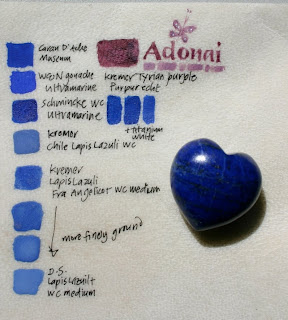
I have been fortunate to be able to play with some genuine lapis lazuli and Tyrian purple to begin autumn.


Here you can see the colours on vellum, with a small lapis heart. I have compared the lapis with modern ultramarine pigments. The Kremer lapis pigment has been purified according to Cennini’s recipe.
I was recently asked by a delightful Welshman living in New Zealand to inscribe his wedding vows as a first anniversary present. The piece was done on a beautiful piece of handmade flax paper as flax had been a theme at their wedding. 


I wanted to incorporate something Welsh, so I chose to do the Welsh title in lettering based on the work of the renowned Welsh artist, David Jones.
The most extensive reference for David Jones’ lettering is the now rare 1981 book by Nicolette Gray, "Painted Inscriptions of David Jones". The copy I borrowed is in the Auckland City Library collection (which was oddly stored in the basement, normally a place for books that are very rarely borrowed, and/or on the way out; it fetches quite a price second hand). If you ever get the chance to borrow a copy it is well worth it to see the unique and beautiful lettering art of David Jones. The book is also an insightful investigation into his artistic vision.  Here are two links to the National Library of Wales which holds a collection of his work and you can see some examples of his painted inscriptions. 
My client loved the piece but had never heard of David Jones. When I showed him a reproduction of his work he immediately thought of the lettering that makes up the Wales Millennium Centre.
The Wales Millennium Centre appears to be a unique and stunning building in which lettering is a central design feature and an integral part of its structure. The letters are in fact the windows in the front face. 

In the online description of the inspiration behind the calligraphy on the building, there is no mention of David Jones. There seems to be a direct reference to David Jones’ work in the design. The letter “S” seemed to follow the particular sloped version that David Jones used. Similarly, the “O” with a dot in the centre, the sloped “W” and the unusual serifs on the “N”. What do you think? Has David Jones been forgotten? 
I was recently commissioned by a Wellington bookbinder, Bill Tito, to inscribe a poem in book form for one of his clients. 


The old world style of the poem was reflected in a gothic style hand for the script. Gothic is something I never normally get to use, so it was interesting to do some extended writing in it.
I have enjoyed making cards recently for friends and members of the family, using brush lettering on rough water colour paper, with collage using interesting textured and hand coloured papers.


Finally I have some Caran d’Ache Luminance coloured pencils to play with. Can I say they are gorgeous. 


The pencils themselves are made using a most beautiful light ash coloured wood with a silky varnish which is lovely to hold. The feel of them is unlike any other pencils I have used before. The leads are soft, with a slight bit of flaking when you use them; opaque and brilliant in colour.
I bought a small selection from their full range of 76 colours. I was surprised to see that the colours I had chosen were all the colours in my garden at the moment. 


So, here is my play with the pencils and my water colours following my garden flowers colour scheme.


I’m very happy with the Luminance pencils so far. I’ll be very interested to see how they respond to my lightfastness testing, given their claim to exceptional lightfastness properties.


If you are wondering, "Scriptrix" is the Latin feminine term for a scribe. An example, is a manuscript of moral treatises and sermons copied around 1100 by a nun who signed herself as "scriptrix", (Wemple, S. F. & Reno, C.M., Scribes and Scriptoria, in "Women in the Middle Ages" (2004) eds. Wilson, K. M. & Margolis, N., Greenwood Press, London, p. 831; the original manuscript is Oxford, Bodleian Library, Bodley 451). "Scripsit" is the Latin masculine term for a scribe and has historic usage by women and men. "Scriptor" is another masculine term for a scribe.

Wishing you peace at Easter.


Saturday, January 16, 2010

Princes, Protocol & Pencils


It seems such an age in many ways since my last entry. Luke, my little cherub, is now almost two and into everything. His birth seemed to usher in many changes to our lives. For my husband, it was a change from full time student, to looking for a full time job. The best job available was in Wellington, so for all of us it involved selling a house and buying a new house in Wellington, with the entire family moving in November 2008. For the girls, a new school. For me, it meant leaving family, friends and my Auckland clients. For someone like me who doesn’t like change, it was a lot of change.


Although many of my Auckland clients continue to send me work in Wellington, it has been nice to finally have some new Wellington clients. A highlight and privilege has been starting to do work for New Zealand Parliament. This has included some work around Prince William’s New Zealand visit that has started today.

It always is a delight to be the agent in creating something special for another’s loved ones. Wedding vows and special poems that are gifted to people for their anniversaries, birthdays or Christmas are really a privilege to complete.


One highlight of November/ December 2009, was finally getting to meet Charles Pearce. I have had two of his books, “ A Little Manual of Calligraphy”, and “The Anatomy of Letters”, ever since I started calligraphy and they have always been a solid and useful example of fine lettering. The double spread page of flourished Italic from “The Anatomy of Letters” continues to be the pinnacle to which I aim in flourishing. Charles himself was a delight, as well as a reflective and instructive teacher.


His workshop in Wellington “Pen Manipulation Techniques”, taught a modified foundational hand, which exposed me to some pen manipulations I’d never met before. The strength and subtle beauty of the hand grew on me, as well as being delighted by the beautiful, fluid forms that Charles managed to conjure out of a broad edged nib. You would have thought it was a brush.


We have just returned from two warm weeks in Sydney over Christmas and New Year. One highlight was having sulphur-crested cockatoos and rainbow lorikeets as our breakfast companions. Another was trailing around a number of Sydney art shops. Unfortunately, Wills Quills wasn’t open over the time we were there, but I particularly liked Parkers, hidden in Sydney’s historic Rocks area, and Oxford Art Supplies in Chatswood, which also had a very impressive bookshop.

Pantone recently indicated turquoise to be the colour for 2010. So for Christmas I received an interesting piece of food and travel writing by the same name, “Turquoise: A chef’s travels in Turkey” by Greg and Lucy Malouf (Hardie Grant books 2007). I have always been interested in Turkey, and Persian manuscripts, so I look forward to learning more about its history and culture.


I am always interested in any new developments on the colour pencil market. For some time I have been interested in the Caran D’Ache “Museum” range of coloured pencil leads, which claims to be a premium range in terms of quality and light fastness. The fact you need to purchase a separate, and expensive, lead holder has always put me off until this summer, when I finally bit the bullet and purchased some. I have found the colours to be beautiful as well as intense, and the leads are if anything, very soft to work with. They are also water soluble which gives you another range of fun options to try out.


Their only draw back is that they are loose leads which need to be interchanged in the lead holder. Being a person who tends to work in the fast and furious mode, this is really a bugbear. It is interesting that Caran D’Ache has recently put out a new premium range “Luminance”, which comes in the more usual form of wooden pencils. It makes me wonder if the “Museum” range, with its separate lead holder, hasn’t been popular. I have ordered some of the “Luminance” pencils from overseas, as nobody in New Zealand stocks them, and I look forward to trying them out.

Another interesting find while perusing the art shops in Sydney, was the Old Holland range of watercolours. I have seen the Old Holland oils in New Zealand but I didn’t realise they had a watercolour range. The enormous range and intensity of their colours looked very impressive on the actual colour chart at the shop, and they claim to be 100% light-fast, which seems a little bold to me. They were tempting enough for me to buy a few to check out. My initial reaction is that they are very nice to work with.


I came home with a book I hadn’t heard of at all; “Calligraphy: A Book of Contemporary Inspiration” by Denise Lach ( Thames & Hudson, 2009). The book is an inspiration, not only for the mainly abstract lettering of a textural nature with a variety of tools, but for the wonderful photos of natural patterns, from a close up of a leaf’s veins to an image of the pattern tide and wind leave in the sand.

Many friends helped out enormously when little Luke was born. Theresa Cashmore helped in so many ways with clients, and at the drop of a hat, with tutoring an overseas calligraphy student. Dr Allan Taylor helped me to sort through the muddle that was my head at the time. Rev Stan Thorburn also helped us at this time. Many school mums and church friends helped in umpteen small ways that made life manageable in the upheaval.

Wellington, now seems more like home. I enjoy the beautiful Wellington harbour in all its many faces; brilliant sun to impressive storms, although the wind and cold takes some getting used to sometimes. I enjoy our small community of Eastbourne, and its relatively remote and serene, peaceful location, despite being a half hour drive from Wellington city. We live in Rona Bay, surrounded by a strong bay of steep bush covered hills with the beach before us. There are birds; moreporks calling at night; tuis, bellbirds and fat woodpigeons by day with the odd kingfisher; seagulls, shags, herons and oystercatchers by the seaside.

I hope the new year continues in the fresh way that new years do, and I get to add to this column a little more regularly.

Monday, December 31, 2007

Colour Counterpoint: From Pliny to Cyberscribes

Happy New Year to everyone.


Veni Emmanuel Christmas 2007

The year that has been, 2007, was a big challenge for me and a time of growth both professionally and personally. Most of my writing this year has been to meet the requirements of the university for my PhD. The year ahead, 2008, will begin with a holiday back in the beautiful Hokianga in the far north of New Zealand looking for pipis, blackberries, and some artistic inspiration, as well as enjoying time with the family. There are a number of interesting art and craft purveyors in the Far North so it will be a good opportunity to take a look as I take a break in the expectation of my third child being born toward the end of February.

My year has probably been fuller than ever, never a dull moment. I continued to take on calligraphy work as well as completing my first provisional year of PhD studies looking at occupational hazards of scribes and illuminators.

I am enjoying studying again, and fully appreciate what is now available to tertiary students via the internet and online library resources. It makes it feasible for me to study at home in the evenings using my computer, something that was impossible when I finished studying 18 years ago for my M.Sc. The computer seems much more familiar these days and my typing isn’t quite so atrocious. I even gave a powerpoint presentation (in Auckland) on my studies thus far in November to a panel of established Massey and AUT University supervisors, Auckland and Wellington based, for my first year assessment. It was very well received with a number of encouraging comments. With special thanks to Dr Rachel Page, Director in the School on Massey University's Wellington Campus for the special courtesy of penciling the meeting in.


Working under an ultraviolet nightclub lamp at twilight

I began the year with some very interesting work arriving in the studio including a real doozy from a big ad agency looking to impress its clients with a new range of Macleans toothpaste. I was asked to write 100 A4 letters in invisible ink! So I can hear you ask how is it done? Answer: in the dark under UV light, so I purchased a nightclub grade UV bulb and some safety goggles! We didn't need to use the forensic grade marker pens, little girls' standard diary pens were just fine and less expensive. It was a fun job to get, but just once I think. My husband uses the product though. Perhaps I will take a leaf out of Anne Geddes' book in 2008 and restrict accession to such requests to the the Moroccan royalty, King Mohammed VI and Princess Lalla Salma.

So how many of you have considered what “New Zealand” means literally? New Denmark of course. I have had some lovely correspondence earlier this year with a Danish calligrapher, Lise Kirketerp. Our correspondence was not fluent in either Danish or English, but beautiful letters and a charming Danish website made for nice exchange. Lise knew of Peter Gilderdale, but had no idea he lived so far away in New Zealand! Peter has had the best selling Danish calligraphy text book “Kalligraphi: Kunsten at skrive smukt” for some years having been reprinted 3 times. The images of Lise’s studio look just adorable.

For those of you who have been looking for the results of my lightfastness test on some of the new Derwent coloursoft pencils, here they are.


To be fair to Derwent, I could only purchase them as a set of 12 in New Zealand, and looking at the lightfastness rating on their website, there are other coloured pencils in their range with higher lighfastness ratings in similar shades, if you were able to purchase them individually. For example, the bright lilac included in the 12 set has only a 2 rating (low lightfastness) while pale lavender has an 8 rating (high lightfastness). Their ratings seem to be accurate. It was suggested to me that spraying with studio fixative can improve the lightfastness, so the left hand band of the sample has been sprayed with studio fixative. It has made a slight difference with most of the pigments, but it does not significantly increase the lightfastness of those pigments with very limited lightfastness.


It was great to host Dave Wood over from Australia this year to teach traditional raised and burnished gilding. Pictured above with New Zealand Calligraphers' liaison officer for the northern city of Whangarei Bevan Holmes, Dave is a master calligrapher and gilder (a fellow of the Society of Scribes & Illuminators), with all his gold work finished to a mirror like shine. My effort at the workshop is pictured below.


The group that attended also had the advantage of viewing some of Dave’s recent work, including images of his large commissioned piece for the Queensland State Library, which is now permanently housed in display cases in the foyer of the library. Those of you attending the Chicago Calligraphy Conference next year might like to consider taking Dave’s class, I doubt that you would regret it.

I mentioned in a 2006 column for the New Zealand Calligraphers’ Newsletter that I particularly like the Foundational hand in the Purewa Cemetery memorial book that I work on which I have always thought to be an attractive feminine hand.


Purewa Cemetery Memorial Book- the ruler markings on the left are in millimetres

Chatting with Dave Wood recently I have found that he met the person whose writing I admired. Dave was formerly a New Zealand resident. Apparently she traveled to London and was a student at Edward Johnston’s old Central School for two years! So what is her name? The most information that I can get so far is that her Christian name was/is Margaret, and if she is still alive she would be in her 80’s. Her beautiful writing was all done with a quill. Let me know if you can fill in the story.

Susan Hopkins, from Santa Barbara, was a very welcome visitor in November. We enjoyed a day together working on various ruling pen and pointed pen styles as well as sharing stories and thoughts on illustrations, journaling, life, etc. It is remarkable how small the world can be, Susan having been referred to me by a friend on cyberscribes who knew that Susan was coming down under to follow the work of another New Zealand artist also. We had alot in common, Susan having spent her working life as an art teacher to deaf children and my husband now beginning to teach Massey University students audiology including introductory deaf education. I hope to get to Santa Barbara some time soon.

I have been studying the pigments that were used historically in manuscripts throughout this year. Here is a picture of me grinding lapis lazuli in September.


It is amazing the analytical research that has been done in the last 15 years or so, that has enabled us to know exactly what pigments were used at different places and at different times. However, it does not answer all my questions with regard to how they were manufactured and processed, and by whom.


Modern and Traditional Pigment Samples on Vellum. You may have noticed the etching on a number of my samples- the native roaches have singular taste it appears!

Study has been an exciting adventure, with highs when you find a piece of information you have been trying to discover for some time, and lows when you don’t seem to be finding anything useful.


Cheryl Porter and moi

The culmination and highlight of the year’s work was having Cheryl Porter teach her “Inks and pigments in early manuscripts” lecture series and workshop in Auckland from the 3-7 of December at the Whitecliffe College of Fine Art, a private tertiary college.


Whitecliffe College, Grafton Campus Auckland

Cheryl is a manuscript conservator whose interest in historical pigments has taken her on some amazing trips, such as the Armenian border in search of Armenian cochineal.


Mexican Cochineal and Kermes- the ruler markings are in centimetres

I had been in correspondence with Cheryl since the beginning of the year as she is a specialist in manuscript conservation and an authority on mediaeval pigments. Cheryl resides in England, though is originally from the backblocks of Western Australia, and works throughout the world. Cheryl’s next 3 year contract is at the museum in Cairo, Egypt.

Whitecliffe College is housed in some beautiful buildings built in the 1920’s, originally as a Theological College. Unfortunately, the art school is moving to new premises in the middle of 2008, apparently the buildings have been bought by Tom Cruise.

We had an interesting group of people attend who were all able to contribute their own particular skills and knowledge. It was well subscribed by librarians, art historians and interested individuals from Auckland and Dunedin, including Professor Stephanie Hollis from the University of Auckland. It was particularly interesting to have a session at Auckland City Library “Rare Book Room” examining three manuscripts which turned into a very insightful, interdisciplinary study. The Anglo-Saxon scholars provided information on the text, the book conservator on the binding, Cheryl provided information on the pigments, and the odd calligrapher added information on vellum and working practices.


Cheryl Porter manufacturing Madder Lake

So, what did I discover? First, that practically any pigment, such as vermilion, orpiment, ochre or woad, comes in a variety of shades. The colour is also altered by how finely the pigment might be ground and what binder has been used. We obviously couldn’t experiment with how colours might change over time, but this would also be a factor.

Secondly, I have an increased admiration of the skills required by scribes and illuminators in using some of these pigments so successfully, many of which are extremely difficult to use. For example, a bright azurite or malachite is so coarsely ground that it becomes extremely difficult to paint with and to get any sort of fine line with it. Similarly, sap green is extremely sticky to work with. Also, each pigment needs to be carefully prepared before you can start to paint, by grinding and combining with a binder. Some of the organic pigments after being collected and dried, must be warmed in water and then various additives such as alum and/or potassium carbonate added to produce a lake pigment.

We painted out a variety of pigments from the medieval palette over the five days; earth pigments, natural minerals, manufactured minerals, inks, and organic colours; the pigment samples that I painted can be seen in the images. Just don't spill the oak gall ink (metallo-gallic ink) on your sandstone floors!


We also had a go at painting some alum tawed skin using organic colours, which was the traditional book covering material used in the medieval period. It is a lovely thick, soft and flexible white skin that was also used to make gloves, which can be transformed into brilliantly coloured book coverings. I have become a member of the International Council of Museums (ICOM) on Cheryl’s advice and have already found their correspondence to be very rewarding.

On another not quite so old note, I was asked to participate in my daughter Shelley’s school “Victorian Day”, endeavoring to teach Victorian writing, that is copperplate, to 40 7-9 year olds. We were all rather covered in ink and I lost about 20 nibs but really enjoyed a precious opportunity to introduce another generation to the delights of calligraphy.

I recently had some extended correspondence on cyberscribes with a number of members including Séamus who pointed me in the direction of some online advice on woad. So prior to Cheryl’s visit and after some online searching I found an interesting French boutique and art material supplier Bleu de Lectoure. So this Christmas I had a number of authentic woad items under the tree including a lovely scarf, some ink, pigment and watercolour. Apparently they may be supplying Levi Strauss nowadays with their historic dye which is now cropped more sustainably and processed more efficiently.

I have to say I have enjoyed reading some historical books this year which I thought would bore me silly. Humanity, and history, is just fascinating of course, and to find someone’s thoughts that you can wholeheartedly agree with, even though they may have lived hundreds of years ago, is amazing. I have even read much of Layamon’s Brut, a middle English recount of King Arthur that was very special to C.S Lewis towards the end of his life. But that’s a story for another time. Pliny the Elder’s “Natural History” Book 33 (AD 70), begins with his thoughts on humanity’s strange relationship with nature in search of metals:

“We trace out all the fibres of the earth, and live above the hollows we have made in her, marvelling that occasionally she gapes open or begins to tremble – as if forsooth it were not possible that this may be an expression of indignation of our holy parent! We penetrate her inner parts and seek for riches in the abode of the spirits of the departed, as though the part where we tread upon her were not sufficiently bounteous and fertile. And amid all this the smallest object of our searching is for the sake of remedies for illness, for with what fraction of mankind is medicine the object of this delving?”

I also delighted to read the 1573 English treatise “The Arte of Limming” as much for the language as for the information. I am now enjoying Nicholas Hilliard’s “Art of Limning” for much the same reasons, and to discover an artist far more pedantic than me! Hilliard painted delightful and extremely delicate miniature portraits of Queen Elizabeth I, Sir Walter Raleigh and the like, so I guess he had even more reason to take care.

Below is some doodling using some "new" antique ruling pens that I received for Christmas and a range of commercially available watercolours, mostly Schmincke. My old faithful ebony ruling pen is joined here by a bone handled, smaller pen and two larger ivory handled ruling pens one of which has been gold plated. The gold plated one is my favourite so far.


The new ivory and bone handled additions to my antique ruling pen collection - Happy New Year!

Wishing my readers all a very happy new year.

Regards,
Alison.

PS Congratulations to Akiho Sugiyama- now where are you Akiho?