The home stretch for 2006 has been quite an adventure. Updating the blog has played second fiddle while I have completed the requirements for the provisional year of my Ph.D. This has been successful, thank you for your well wishes everyone.

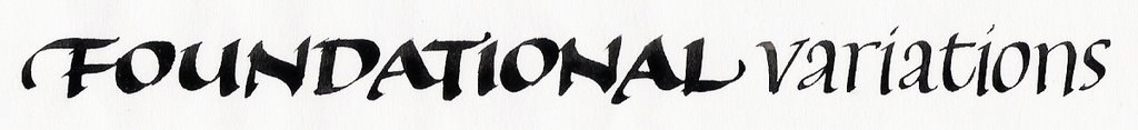
But I did manage to squeeze in two editions of my column “Ask Alison?” for New Zealand Calligraphers, the Foundational Variations workshop for Kaingaroa Calligraphers in Kaitaia, Northland, a Modern Pointed Pen workshop in my St Heliers studio here in Auckland and contact many international scribes and publishers in my role as Vice-president of New Zealand Calligraphers. I also have a book review in the pipeline to be published by the Association for the Calligraphic Arts in the U.S.A and have updated the calligraphy page for Wikipedia. My scripture class had an end of year production too, so we made a banner and I wrote a song for them to all sing. The banner is at the top of this post- it is a glimpse of the view of the Hauraki Gulf looking out to Rangitoto Island from St Heliers Bay featuring the flower of the New Zealand Christmas tree, the Pohutukawa tree.

The ladies from Kaingaroa Calligraphers, Kaitaia in August 2006. Thanks go to Sue Clark.

A collection of New Zealand Calligraphers' efforts at my Modern Pointed Pen workshop in October 2006.

Some keen Modern Pointed Pen participants in my St Heliers studio.
I am happy to say that all of this time was very well spent. The New Zealand Calligraphers' Newsletter under the editorship of Carol Hunt goes from strength to strength. My workshops were absolutely delightful and any reason to visit New Zealand’s Far North gets my full attention. New Zealand Calligraphers as a society has also been strengthened by renewed vigour of the committee and a number of new members these last couple of months. Everybody in the society is contributing to our work which is the way societies grow. 2007 looks very bright for our expanding vision and opportunities.
I have also caught a couple of significant exhibitions. Most fond of house paints for his panels was New Zealand’s most famous painter. Colin McCahon, and his paintings with words, have been well represented in Auckland galleries recently. If you would like to investigate New Zealand’s most famous painter for yourself try www.mccahon.co.nz where you can browse for over 1200 images of his. Is it possible to consider McCahon a calligrapher as Bloem broadly does (2002: 25)?
I attended the exhibition “Colin McCahon: The Titirangi Years 1953-1959” at Lopdell House Gallery this October. I have seen pieces of Colin McCahon’s in various galleries in New Zealand and Australia over the years, but never a full exhibition.
The exhibition featured a number of works where words were the main element. The highlight for me was “The Wake” (1958), a series of 16 unstretched canvas paintings approximately 16 metres long that completely filled the small side room on all four walls. The piece renders a poem by McCahon’s friend, John Caselberg. The poem is an expression of grief at the death of his dog, Thor, a great dane. Never has a dog received such a eulogy! The canvases are treated in a watercolour type style with dilute paints and inks. To be completely surrounded by a poem, as a series of images, brush marks and words, all imbued with colour, is an experience in itself. The original exhibitions were accompanied by John Caselberg reading the poem, with viewers seated on the floor.
A parallel exhibition is on at Auckland City Art Gallery- “Colin McCahon: The Gallery Years”- until 17 December. Featured is work of McCahon’s from 1953-1964, including another major work, the 16-panel “The Second Gate Series 1962”. This work is much more painterly in style, being alkyd on hardboard, but again works with words that McCahon requested from John Caselberg- a message about the threat of nuclear war. Together with the “words” panels are purely abstract panels, many of which feature McCahon’s gate motif. The combination of the words, colours, abstract images and the large scale again make a powerful impact.
New Zealand Calligraphers' President and my Ph.D co-supervisor, Peter Gilderdale, has just launched his first blog on Google. It is well worth a look- http://calligraphicomment.blogspot.com/ .

Tane Mahuta, New Zealand's biggest Kauri tree, Hokianga, Northland. My daughters Shelley Samantha and Georgia Magenta share the foreground. Shelley has been the subject of a September article in New Zealand Calligraphers' Newsletter as she is our youngest calligrapher at 7 years old. Shelley is tutored by my good friend Theresa Cashmore (a former student of Dave Wood's), who like Shelley is left handed. Below is a picture of Shelley hard at work for the photo shoot !

I am looking forward to summer holidays with my family back in Northland. This time on the west coast. I am doing a few calligraphy demonstrations at perhaps New Zealand’s oldest supplier of calligraphic materials, the Stone Store on Kerikeri basin. The Stone Store is the oldest stone building in New Zealand and Kerikeri’s major tourist attraction, formerly the hub of the earliest activities of New Zealand’s Anglican missionaries in the Bay of Islands. It was in fact Kerikeri's general store for all sorts of things until very recent times. It still has the best boiled lollies in New Zealand ! The store houses Bishop Selwyn’s old desk which I look forward to helping recommission [small c] when I visit on Saturday December 30 2006, January 6 and 13 2007. See my website for details of my demonstrations and the links for interesting information about Kerikeri, The Hokianga and one of my very favourite spots in the winterless north, Marsden Cross.

Marsden Cross, 36km from Kerikeri, Northland
Drop by and try your hand at the Stone Store if you are in the region.