Christchurch’s recent earthquake has been a sobering surprise. Thankfully, no one was killed, the clean-up continues on, and the calligraphy friends in Christchurch went through it fairly intact. Wellingtonians are now being alot more careful about stocking up for an emergency, as the possibility of one is all a little more real. Our love, thoughts and help still goes out to the people in Christchurch. In the dim distant past, I spent two years studying in Christchurch, and I still remember with fondness, the very bright and frosty winter mornings, biking through Hagley Park on my way to university, surrounded by beautiful trees, ducks and daffodils at this time of year.

Thinking about Christchurch in recent weeks led me to an interesting coincidence of calligraphic interest. Have you ever heard of a penwiper? Sensitive Victorians needed something more refined than a simple rag to wipe the end of their nibs, and went to great effort to create exquisite embroidered and beaded penwipers. I guess this has similarities to creating beautifully embroidered handkerchiefs on which to blow your nose. You can find pattern books on amazon or ebay.

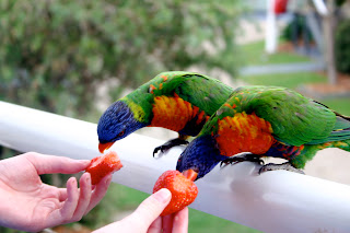
Found in the Southern Alps of Canterbury very near Christchurch, perhaps not so strangely, is a unique and beautiful New Zealand plant Notothlaspi rosulatum, commonly known as a penwiper plant, because its appearance was similar to some of the patterns used to make penwipers.

Well, winter is over and spring has arrived since my last blog. The garden is full of primulas and daffodils, the tuis are fighting in the kowhai trees which are now in full bloom, and there are new lambs about.
Toby Gillman is a boutique winemaker at Matakana, north of Auckland. A number of years ago, I designed the Gillman Vineyard logo, very much as a calligrapher doing my best to capture the vision that Toby had for the label. Toby’s wine has found favour with Ryan Nelsen, the captain of the New Zealand All Whites football team, and I have been helping with lettering for personalised labels, often as gifts to be sent to amazing people and places! It has been a very special last few months to have been associated with the Gillman Vineyard, the All Whites becoming the toast of New Zealand.
I am using quills more and more in my work now. Sourcing a good supply of large flight feathers has been difficult locally. Or so it seemed. After contacting a couple of New Zealand free range turkey proprietors and finding out that their feathers were destroyed in the plucking process, should I be surprised to find the solution on Trade Me? I have found two unique suppliers. First, I obtained some feathers from Margot Ardern, a delightful lady in Tauranga who makes exotic fascinators, those beautiful feather creations worn on race days and for weddings.
Second, Mawera Karetai and family at Feathergirl export a range of feathers in the service of Environment Bay of Plenty: they keep the non native bird numbers under control at no cost to the public this way.
Another fascinating find has been Jim Marshall’s new website. It is a treasure trove and of special interest to one of my recent correspondents, Whetstone. But not for the faint hearted! Jim has a great pdf illustrating historic quill preparation and cutting too! You will notice just how many specialist books Jim has authored on writing instruments, accessories and their maintenance. This includes Victorian Quill Cutters.
I have some colour lightfastness samples for my new pencils that will be ready for review next time. An interesting article popped up in The Wall Street Journal last week on coloured pencil history! The title: As Pencil Makers Push the Envelope, Age Old Rivalry Stays Sharp. Faber-Castell and Staedtler are serious competitors, the article and video are good fun.
I have some colour lightfastness samples for my new pencils that will be ready for review next time. An interesting article popped up in The Wall Street Journal last week on coloured pencil history! The title: As Pencil Makers Push the Envelope, Age Old Rivalry Stays Sharp. Faber-Castell and Staedtler are serious competitors, the article and video are good fun.

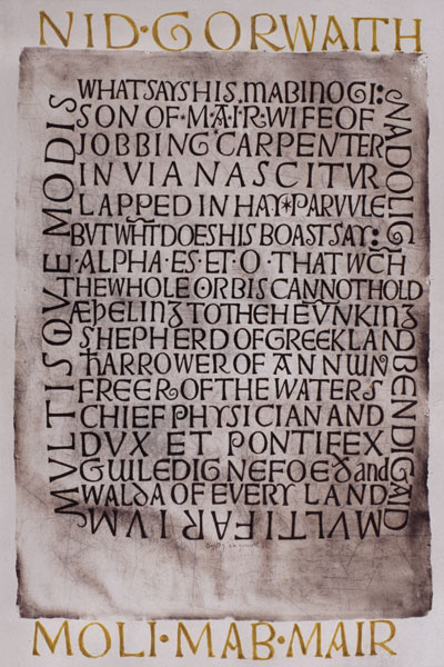
This September I have had the privilege of having a poster from my research on artists’ materials, on display at the Art Technological Source Research (ATSR) meeting in Vienna. The ATSR is a working group of ICOM, the International Council of Museums. I created the versal titles by hand with a quill, and a quote from a 12th century scribe in a Spanish Beatus, in a largely forgotten hand, which Stan Knight calls “Protogothic D1”.
The Australian Society of Calligraphers also invited submissions recently for a new publication. I have had two pieces accepted. The intention is for it to be published before Christmas, and if you are interested, it will be available from their website in due course. It will be interesting to see how their Australian Bestiary project develops too, launched by Timothy Noad in August.
Some interesting developments happened after my last entry on David Jones and The Wales Millennium Centre. Marc Stengel contacted the Wales Millennium Centre with regard to the influence David Jones might have had on the design of the building. The architect, Jonathan Adams, gave a very full response to the way in which David Jones’ work was one influence on the design, together with many other sub-narratives. Mr Adams noted that he has always given reference to David Jones in the public talks he has given on the design of the WMC. Bet Davies, Head of Corporate Affairs at the WMC, also responded. As a fan and collector of David Jones’ work herself, she was keen to highlight the similarities between David Jones’ work and the design of the building in her future guided tours at the centre. Special thanks to Marc for his generous efforts.
Here is another link which contains a variety of David Jones’ work, including some painted inscriptions David Jones - monnowvalleyarts.com. Reminiscent of David Jones is the work of lettering artist Stephen Raw .
Marie Angel, unfortunately passed away earlier this year. Her beautiful illuminations of animals, often captured while delicately balancing on a versal letter, are a delight and inspiration. I received a number of her books for my recent birthday, and I most enjoyed her visual portrayal of the twenty third psalm, with amongst other creatures, a timid rabbit laying down to rest, a rather scary owl in the valley of the shadow of death, and swallows and angel fish dwelling in the house of the Lord. I think some of her books deserve the benefit of modern colour reproduction. Does anyone agree with me, that a Marie Angel retrospective book, beautifully produced, would be a real treat?
One of the most useful books I have in my library is Marie Angel’s “Painting For Calligraphers”. Marie very thoroughly explains composition, painting techniques, materials and heraldry, and illustrates her teaching with examples of her own work and other notable calligraphers and illuminators. And it is through this book I was first introduced to the work of Nicholas Hilliard. Marie Angel herself initially studied the work and teaching of Hilliard to inform her own technique.
Nicholas Hilliard (1547-1619), is best remembered for his beautiful miniatures of Elizabethan royalty, courtiers and noble men and women. He also wrote an informative and insightful, if somewhat rambling, treatise; “Art of Limning”. “Limning” comes from the word, “miniature” and was specifically used to describe miniature painting, as distinct from illuminating in manuscripts. Nicholas Hilliard at National Portrait Gallery

Meeting children has been a feature of my participation in the local Eastbourne market each quarter. I primarily make bold and colourful name plates for children using brush lettering, but I get requests for name plates for teenagers, grown-up sons and daughters, and grandparents in rest homes. The children’s reactions to their names written out, and seeing “live” calligraphy is always very encouraging.
I have been approached to tutor some children in calligraphy. If you know of any children and parents interested please call me on +64 4 562 0950. I am hopeful that my opportunity to demonstrate and teach calligraphy to children is going to grow over the coming summer which is very exciting given the interest received from some Wellington public institutions in inviting me to do so.
I have had a number of very interesting jobs lately. One, has been to provide some lettering for Te Papa’s newest exhibition, "Slice of Heaven: 20th Century Aotearoa", which opened on the 2nd October 2010. One of the requirements was to write in the style of an 11 year old boy during World War II. Some examples proved a little difficult to find, until my father-in-law was able to pass on some beautiful letters he had written home to his mother, having been sent to country Victoria in Australia during the war. Below is a photograph of the antique pen holder I used to complete my first job for the Museum of New Zealand, Te Papa Tongarewa, again some handwritten titles in another WWII style. The penholder is an interesting combination of a New Zealand pounamu (greenstone) handle, which was exported to Birmingham where the rose gold top was added around 100 years ago. The antique pen holder was acquired in Wellington, and came with a vintage nib in very good condition that I have come to like very much, the nib being a Perry & Co 88M.

Another amazing job, was hand lettering some simple yet elegant invitations for adidas to launch a new season collection by Stella McCartney, and her new perfume “Nude”. The invitations were entirely done by hand, with pale flesh colour writing on black paper.

I have just taught a great “Italic for Beginners” weekend. It’s always rewarding to meet new students and I have been particularly encouraged by the level of interest in my various classes and demonstrations recently.

One of the participants was Glenn McDean who is an interior consultant, who spent five years training in specialist paint finishes such as gilding, faux marbling, etc. Glenn wrote the book “The Gilding Kit” which is unfortunately now out of print.
I’m hoping to organise a short but sweet gilding class, using traditional gesso, to create a small illuminated or decorated initial. The gilding process normally takes place over two days, so I am looking at two consecutive Saturdays. If you are interested, please contact me.
This summer we are looking forward to holidaying in the warm Hokianga again, and I will be giving a couple of demonstrations at the historic Stone Store in Kerikeri, Bay of Islands. Demonstrations are on Friday January 7 (10 am- 1 pm) and Saturday January 8 (10 am- noon) and there will also be a short introductory calligraphy workshop on Saturday January 8 across the road at historic St James Anglican Church in the James Kemp Hall between 1.30- 3.30 pm. There is a small charge for materials, so you will have a pen holder and some nibs to take home and play with! Please contact Debbie Lewis at the Kerikeri Mission Station on +64 (0)9 407 9236 to book. Further details are on my website events page. The Stone Store continues to encourage calligraphic curiosity in new generations with a range of penholders and nibs on sale.
Until next time, with a flourish, Alison.


