I’ve been experimenting with mixing watercolours the last couple of weeks. I picked up a wonderful children’s book at the library by Melissa Sweet called “Carmine : a little more red”. Given my own obsession with magenta and pinks I was hooked. Also, it’s almost an exploration of being an artist with wonderful illustrations including one of Carmine’s journal and art tools. Melissa has these lovely little colour gradient squares as part of her collages, and I had to figure out how to do these. Her website is worth looking at too; http://www.melissasweet.net/

So, it’s off to one of my favourite art shops, Studio Art Supplies Parnell Auckland, to look at more Schminke watercolours and books. Unfortunately, buying watercolours is a bit like buying lipsticks; you can never have too many. I came home with a bigger watercolour paintbox and “The Watercolour Artist’s Palette” by Tom Robb. It has a beautiful cover of three lines of rough watercolour mixes beginning with something like a Prussian blue on the left, moving to three different yellows on the right with the most arresting shades of limes, bright greens and biscuity browns in the middle.
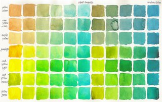
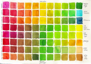
Tom Robb explains how to build a colour library by simply choosing two watercolors and mixing them as a splashy line, or a series of squares, starting with one colour in the left and gradually mixing in the other colour until you see the second colour in all it’s fullness on the right. It really becomes interesting when you do them as a series so you take say cobalt turquoise and mix it in turn with every shade of yellow and compare all the shades of sea green you get.

Even more fascinating is when you take almost opposite colours on the colour wheel and mix them in a gradient. You don’t just get browns (not my favourite colour). You can get all sorts of plums, grapes, greys, moody greens and blues depending on what is at each end.

It’s a bit like a chemistry experiment seeing how different pigments react to each other. Some blend seamlessly, while others give a beautiful dappled effect like shot silk.
With 48 colours in my palette this now means that I have 1128 possible colour combinations ! So I am going to be here for some time !


No comments:
Post a Comment